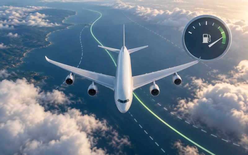
Why do planes not fly in a straight line? Because the map is bent, not the flight. Airplanes follow the shortest path across a sphere, and that path looks like an arc when you draw it on a flat chart, then add winds, weather, airspace rules and traffic control on top of it.
If you have ever watched the seatback map and wondered why your plane appears to wander off toward Greenland instead of driving straight at London, this explains it. The curiosity is completely reasonable, and the answer sits in two different places: the geometry of the globe, and the very human work of flying a real aircraft through a real sky.
What follows is the geometry and the routing behind those maps, in plain English.
Table of Contents
- 1Why Do Planes Not Fly in a Straight Line?
- 2Why do planes not fly in a straight line across the globe?
- 3How does Earth’s curvature change a flight path?
- 4What is a great-circle route?
- 5Why do flight paths curve when viewed from above?
- 6Do airplanes fly around the Earth?
- 7How do wind, weather, and jet streams affect the route?
- 8Why do pilots avoid flying directly through some places?
- 9Why do planes sometimes change course during a flight?
- 10Why do flight-tracking maps sometimes look different from airline route maps?
- 11Frequently Asked Questions
- 12Do airplanes follow the shortest route between two cities?
- 13Are curved flight paths always shorter than straight routes on a map?
- 14Why do planes sometimes fly over the North Pole?
- 15Can a pilot choose a different route because of the wind?
- 16Why do flight-tracking sites show a plane turning unexpectedly?
- 17Is a straight line between two airports possible at all?
- 18Conclusion
Why Do Planes Not Fly in a Straight Line?
There are two separate questions hiding inside that one, and mixing them is what makes the topic confusing. The first is why a route drawn on a flat map looks like a bow. The second is why the aircraft’s actual path through the sky contains turns, jogs and holds.
The second kind, usually in the form of a list, is what most people actually want:
- Great circle geometry. The shortest path on a sphere is a curve on paper. This is the big one.
- Map projection. Nearly every flight map you have ever seen stretches the poles, so straight lines get drawn as arcs.
- Jet streams and winds aloft. Dispatchers will fly sideways to catch a tailwind.
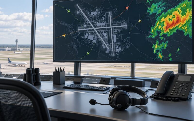
- Thunderstorms and turbulence. Convective cells are worked around by the hundred miles.
- Restricted airspace. Military areas, test ranges and closed sovereign territory.
- Air traffic control. Metering, arrival sequencing and separation rules push aircraft onto published airways.
- Departure and arrival procedures. SIDs and STARs are scripted curved paths, and aircraft land and take off into the wind.
- Noise abatement. Near cities, corridors are designed to keep the route over water or open ground.
Why do planes not fly in a straight line across the globe?
Because a straight line on a flat chart is not a straight line on a round Earth, and once you fix that, the shortest path is the great circle. Add the operational reasons above and you get the wobbling line you see on a tracker.
| What bends the route | Typical shift from the plotted line | Does it change every flight? |
|---|---|---|
| Map projection on your screen | Looks like hundreds of miles; actually zero | Yes, it is always misleading |
| Jet stream and winds aloft | 20 to 100 nautical miles | Yes, the forecast shifts hourly |
| Convective weather lines | 50 to 200 nautical miles | Only when storms are in the way |
| Restricted or military airspace | 10 to 100 nautical miles | Usually, if an area is active |
| ATC metering and sequencing | A few miles of track miles | Often, at busy times |
| SIDs and STARs near airports | Fixed, published curves | Yes, the same procedure every day |
Only one row on that list is a distortion. Everything else is a real, deliberate decision made by a dispatcher and a controller before you ever sit down.
How does Earth’s curvature change a flight path?
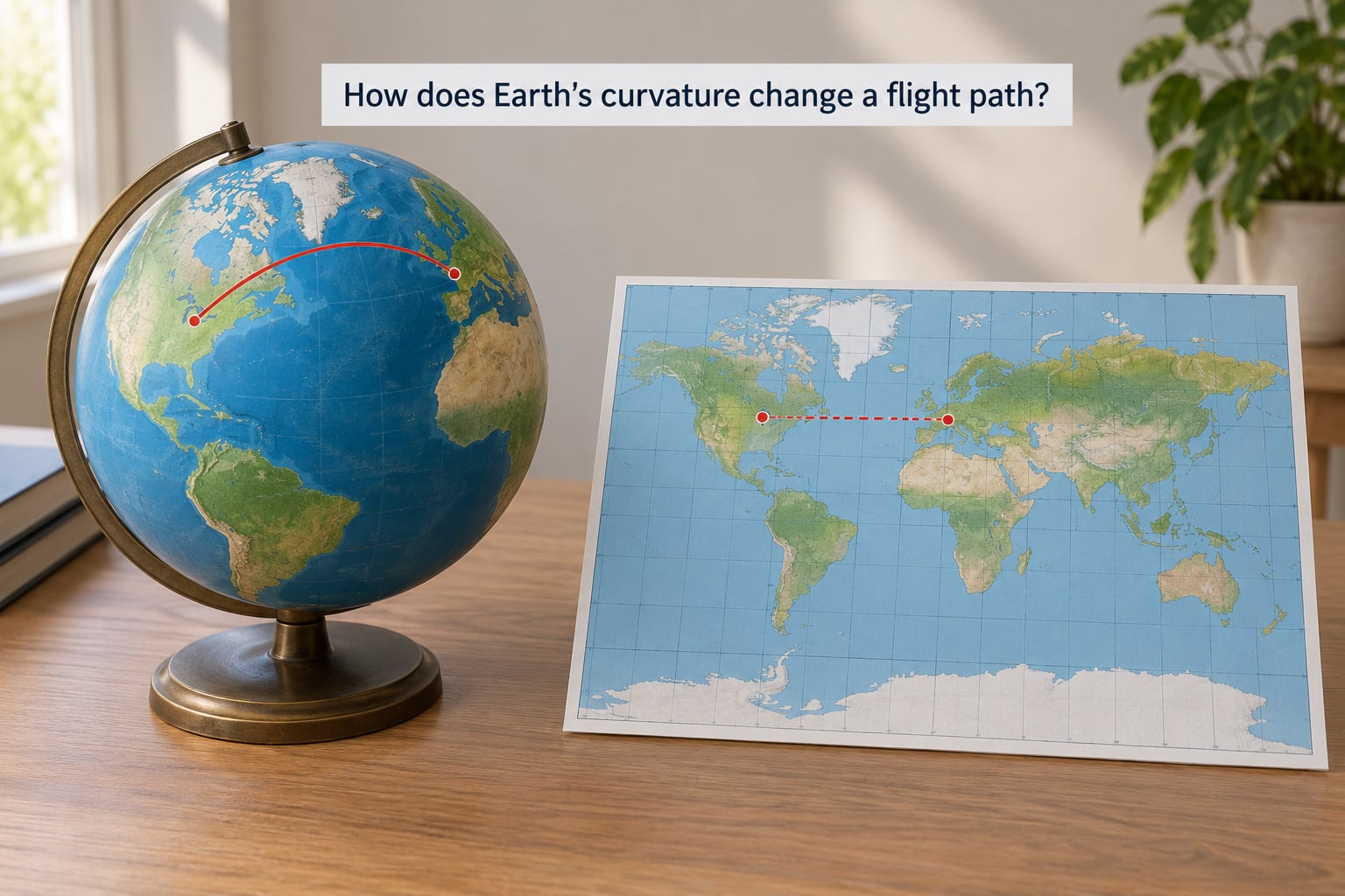
Picture a globe and two points on it. The path between them that is genuinely shortest is not a straight line across the surface in the way a line is straight on paper, it is an arc of a circle whose centre sits at the centre of the Earth. That is a great circle, and it is the only shape that matters here.
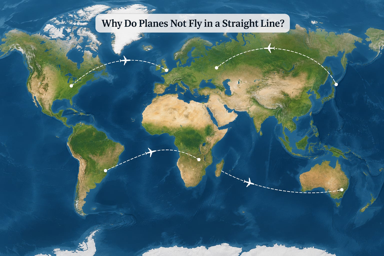
New York to London is the classic example. Straight across a flat Atlantic map, the route looks like it would run north, hook over Greenland and Iceland, then drop down to England. It is roughly 3,400 nautical miles on that great circle, and it does pass close to southern Greenland on an ordinary day.
Nobody is detouring to look at the ice. The northern bulge is simply what the shortest line between those two cities looks like, and a paper chart exaggerates it into something that looks like a detour.
Here is why. Meridians, the longitude lines that run pole to pole, all converge at the top and bottom of the globe. Lines of latitude, the circles running around it, get smaller as you move away from the equator. Any flat map has to stretch those converging meridians into parallel lines, and in doing so it stretches the high north far more than the middle.
What is a great-circle route?
A great-circle route is the shortest path between two points on the surface of a sphere. It is a simple piece of geometry, and every airline flight between two cities starts with one as its baseline before anything else is considered.
So when a traveller asks why do planes not fly in a straight line, the honest answer is that the aircraft very nearly does, and the chart in front of you does not. The route is the straightest line the sphere allows.
The contrast that trips people up is with a rhumb line, which is the path that holds a single compass heading the whole way. On a flat map a rhumb line looks tidy and straight. In the real world it has to keep turning, and for a long flight it is longer than the great circle.
Think about the equator. Flying due east along it, the plane holds one heading the entire way. Flying due east from 40 degrees north, the route has to steer progressively further south, because every degree of longitude down there covers less ground than the degree before it.
For very short hops the difference is negligible, so a plane may fly a single constant-heading track instead of a curved one. Nobody bothers with the geometry when the gap is a few miles. On a transatlantic crossing the gap is large enough to matter, and the great circle wins every time.
Why do flight paths curve when viewed from above?
Three different things get confused here: the route on a flat map, the route on a globe, and the path the aircraft actually flew through moving air. They are never the same shape.
The Mercator projection, which almost every seatback map and wall map uses, cannot show the poles at all. It cuts the globe off and stretches everything near the top and bottom. The classic demonstration is Greenland looking about the size of Africa, when Africa is roughly fourteen times larger in area.
That stretching has a direct effect on your route. A line that is dead straight across the real globe gets drawn as a graceful curve across Mercator, and the longer the flight and the more polar the track, the more curve you see.
You can check this yourself in about a minute. Open any flight tracking site, find your route, and switch the view from a flat map to a globe. On the globe the same track is a straight line. That single toggle settles the argument better than any explanation.
Do airplanes fly around the Earth?
Every flight is, in a small way, a lap of the planet. An aircraft is always following the surface of a sphere, and the moment you travel far enough in any direction the path has to bend to stay on it.
Some routes make that obvious. Flights between cities at very different longitudes and latitudes can have their shortest path pass close to a pole, because going over the top can genuinely beat going sideways. On a flat Mercator chart those routes look like they climb vertically and then fall straight down, which reads as absurd.
So has anyone flown right around the world in one straight line? In the strict sense, no, and the reason is geometric rather than technical. Two antipodal points, the exact opposite sides of the Earth, have no single unique shortest path between them. Every great circle connecting them is equally short, so the pilot picks one and there is no better answer to compare it against.
On polar routes close to that geometry, the path can look startlingly straight and constant. That is the one case where a reader watching a tracker sees a clean line rather than an arc.
How do wind, weather, and jet streams affect the route?
Winds are the largest genuine reason a real route differs from the theoretical line, and they are why the same city pair gets a different track every single day.
A jet stream is a river of fast-moving air, often two hundred or more knots wide and running west to east across the Atlantic and the Pacific. Flying with it adds directly to your groundspeed, the speed you actually cover over the ground. Flying against it subtracts just as directly.
The arithmetic is straightforward. Take a 2,000-mile leg and a cruise speed of 500 knots in still air. Straight down the middle it takes four hours. With a 100-knot tailwind you make 600 knots over the ground and it takes three hours twenty minutes. On the return, against that same wind, you are down to 400 knots and it takes five hours.
Same two airports, same distance, two extra hours, and the airline was not being inefficient. It was routing around a headwind.
That is also why eastbound crossings usually beat westbound ones, and the usual explanation people reach for is wrong. The Earth’s rotation does not shorten an eastbound flight in any meaningful sense. The jet stream does the work, and its position drifts with the seasons, which is why the gap between the two directions is not a constant.
Across the North Atlantic, controllers publish a system of lettered tracks each day, chosen to sit where the jet stream is that day. Airliners that want fuel and time savings request one of those tracks. The map you see in the morning and the one your colleague saw last week are genuinely different.
Weather bends routes too. A line of thunderstorms can be worked around by a hundred miles or more, and pilots will happily give up a detour to avoid it. Mountain wave turbulence, the standing wave that leeward of tall terrain can throw thousands of feet up, is another one. That one is not visible as a storm on radar, which is why it catches people out.
Your indicated airspeed, the number on the instrument, barely changes in all of this. The winds at altitude are what shift your progress, and they are forecast, then updated as the flight goes on.
Why do pilots avoid flying directly through some places?
Some of the sky is simply not available, and the reasons are legal, military and practical rather than mysterious.
Military Operations Areas are blocks of airspace reserved for military training, where civilian aircraft either stay out or enter under strict rules. Test ranges, rocket launch corridors and temporary closures around live fire events behave the same way. Sovereign airspace is the simpler version: some countries do not permit overflights, and the route has to go around rather than through.
Over the oceans there is a different constraint entirely, and it has an unglamorous name, ETOPS, extended-range twin-engine operations. It is a certification standard built around how long an aircraft can fly on one engine before it must be able to reach a suitable diversion airport. Set the number generously, and wide stretches of ocean become usable. Set it tightly, and the route bends toward land or toward the islands that sit along the way.
This is the nuance most people get wrong. ETOPS is not a rule about being over water, it is a rule about how far you can be from somewhere safe to put down. That is why transoceanic routes are not simply the shortest line between two airports.
Terrain and emergency alternates add to it. A route that keeps a suitable diversion airport within reach has more options if something goes wrong, and near the mountains an airway may be shaped to follow a valley rather than the shortest heading.
Why do planes sometimes change course during a flight?
By this point in the flight the published route is mostly behind you, and the aircraft is being adjusted in real time. Controllers issue new instructions, and the crew works with them.
Traffic separation is the constant one. Aircraft must stay a set distance from each other both horizontally and vertically, so when the airspace gets crowded, sequencing changes. A plane might be asked to slow down, descend earlier, extend a downwind leg, or hold in a racetrack pattern above the destination until its slot arrives. That holding pattern is where a great many anxious first-time fliers spend their worst ten minutes.
Then there is the weather itself. Convective cells build and shift, so a route that looked clean at dispatch may need a new clearance an hour later. ATC will offer a deviation, the crew accepts or requests something better, and the path bends by some tens of miles.
Fuel and company policy come into it as well. A carrier with a specific fuel figure to protect may ask for the smoothest routing available rather than the quickest one. None of this is the plane wandering off. It is a crew and a controller managing a moving problem.
Why do flight-tracking maps sometimes look different from airline route maps?
Because you are rarely looking at the same thing. The curve on your airline’s app is a published, scheduled route drawn on a stretched projection. The line on a tracking site is data reported by the aircraft, and it tells you where the plane was.
Three gaps account for most of the confusion. First, projection: the tracking site may also be using a flat map, so the arc is baked in before the flight starts. Second, sampling: position reports arrive every few seconds to a few minutes, so the plotted line is a series of dots joined up rather than a continuous track. Third, scale: an airport departure procedure lasting four minutes can occupy the same space on the screen as an hour of cruise.
The airline map also has a commercial reason to look tidy. A clean sweeping arc across the ocean sells the idea of a simple trip better than a jagged line that stops in the middle of the Atlantic because of traffic.
Switch any tracker to a globe view before drawing conclusions, and give the departure and arrival the short distance they deserve. What is left in the middle of the plot is the flight.
Frequently Asked Questions
Do airplanes follow the shortest route between two cities?
Usually yes, and that shortest route is a great circle, the curved arc on a globe that looks like a bow on a flat map. The airline builds the flight around that line, then adjusts for winds, weather, restricted airspace and traffic. So the route is genuinely the shortest practical one, even when it looks longer on your screen.
Are curved flight paths always shorter than straight routes on a map?
The opposite is true. A straight line drawn between two cities on a flat map is usually longer than the great circle an aircraft flies, because the map stretches the polar regions and turns a straight surface path into an arc. This is most obvious on long routes, where the gap can run to several hundred miles.
Why do planes sometimes fly over the North Pole?
When two airports sit at very different latitudes and longitudes, the shortest path across the sphere can pass close to a pole. Flying over the top may be shorter than going sideways. On a flat Mercator map that route looks like a vertical climb followed by a vertical drop, which reads as a strange detour when it is the opposite.
Can a pilot choose a different route because of the wind?
The crew can request it, and dispatchers plan around winds from the start. A 100-knot tailwind can cut an hour from a long leg, and North Atlantic tracks are repositioned daily to sit inside the jet stream. Pilots cannot simply decide alone, since air traffic control has to approve the track and separate other aircraft.
Why do flight-tracking sites show a plane turning unexpectedly?
Position reports arrive at intervals and get joined into a line, so the plotted track looks sharper than the real one. Departure and arrival procedures, weather deviations and traffic sequencing also produce genuine turns. Switch the map to a globe view and ignore the first and last few minutes, and the flight usually looks straight.
Is a straight line between two airports possible at all?
Yes, the aircraft flies a straight line across the globe and it is the shortest one available. What you rarely see is that line drawn straight, because almost every chart stretches the poles. For very short hops the difference is so small that a constant-heading track is used instead, and no one corrects the map.
Conclusion
The curve you see on the screen is mostly the map, not the aircraft. Pilots fly the shortest line across a sphere, and flat charts stretch the poles badly enough to turn that line into an arc. Everything else that bends the track has a name and a reason: jet streams, thunderstorms, restricted airspace, published departure and arrival procedures, and traffic control keeping aircraft apart.
If you want to settle it for yourself, take any flight you have booked, open a tracking site before you leave, and switch the view to a globe. It takes a minute, it costs nothing, and it answers the question better than any chart ever will.